Locako
Illustration, Packaging Design
Packaging for the low carb,
keto friendly brand
Locako built a strong customer base thanks to their unique products. While their brand was already established online, some of the products were not performing well in the store environment.
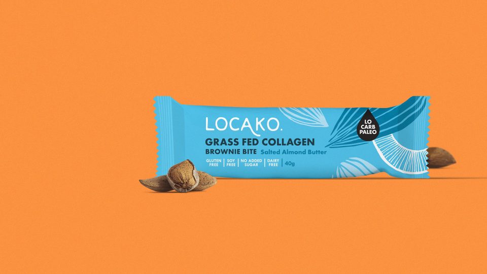
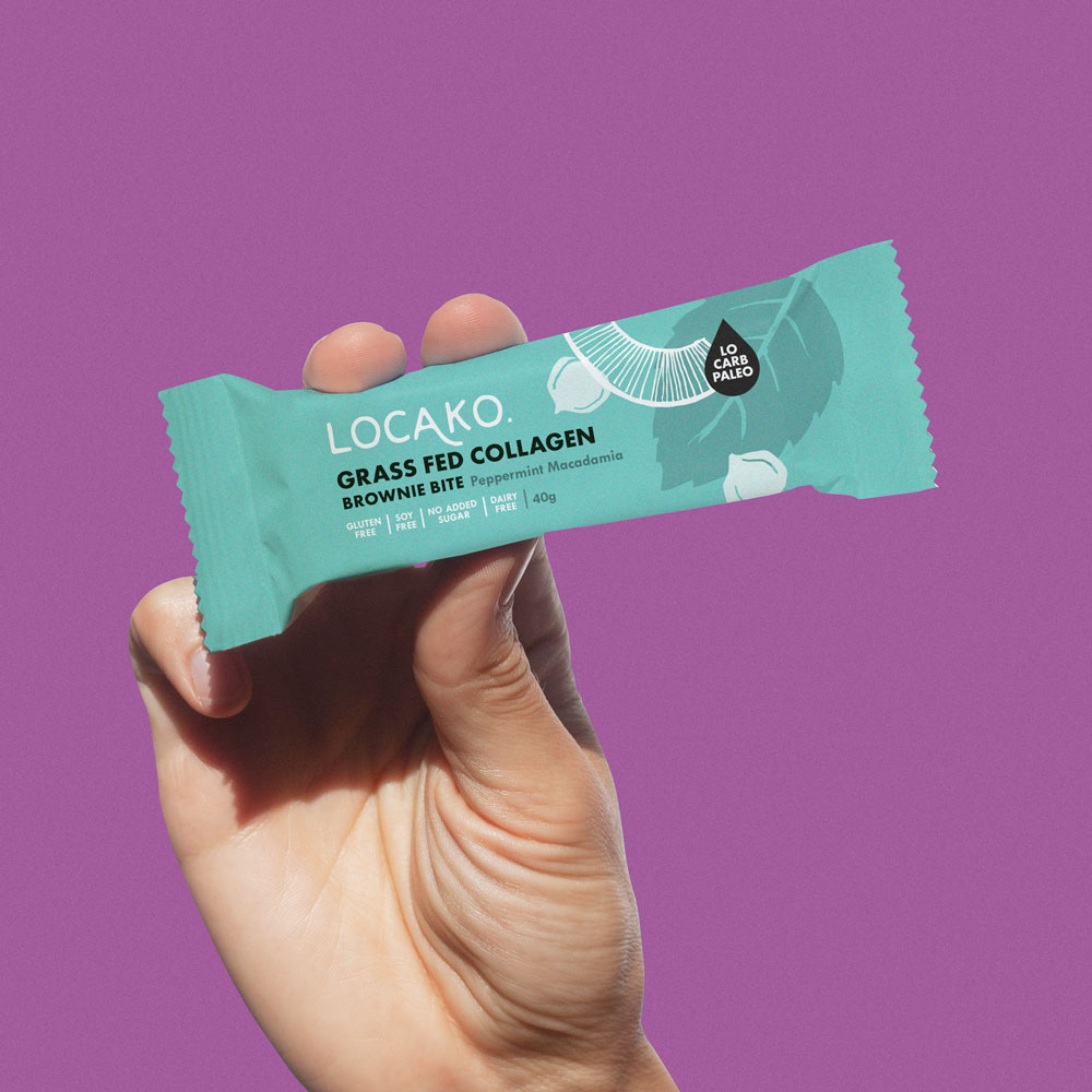
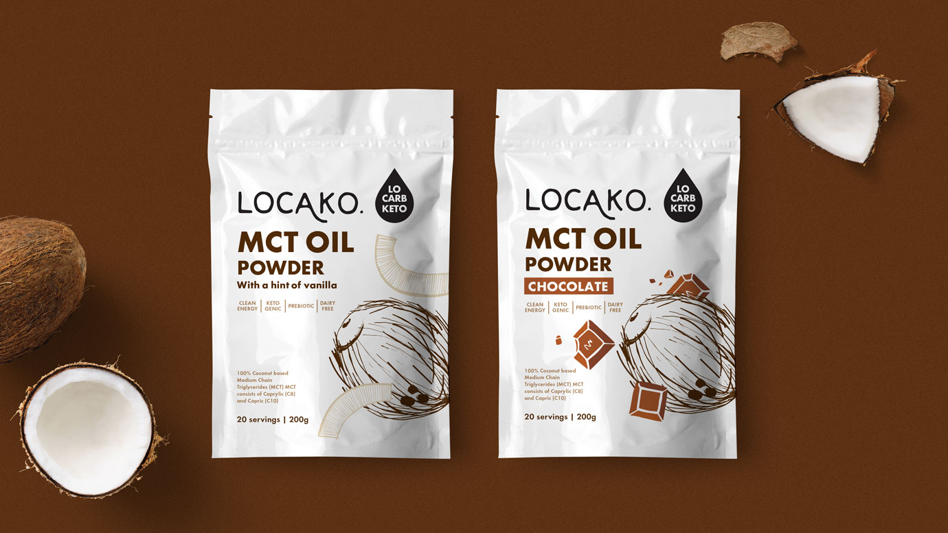
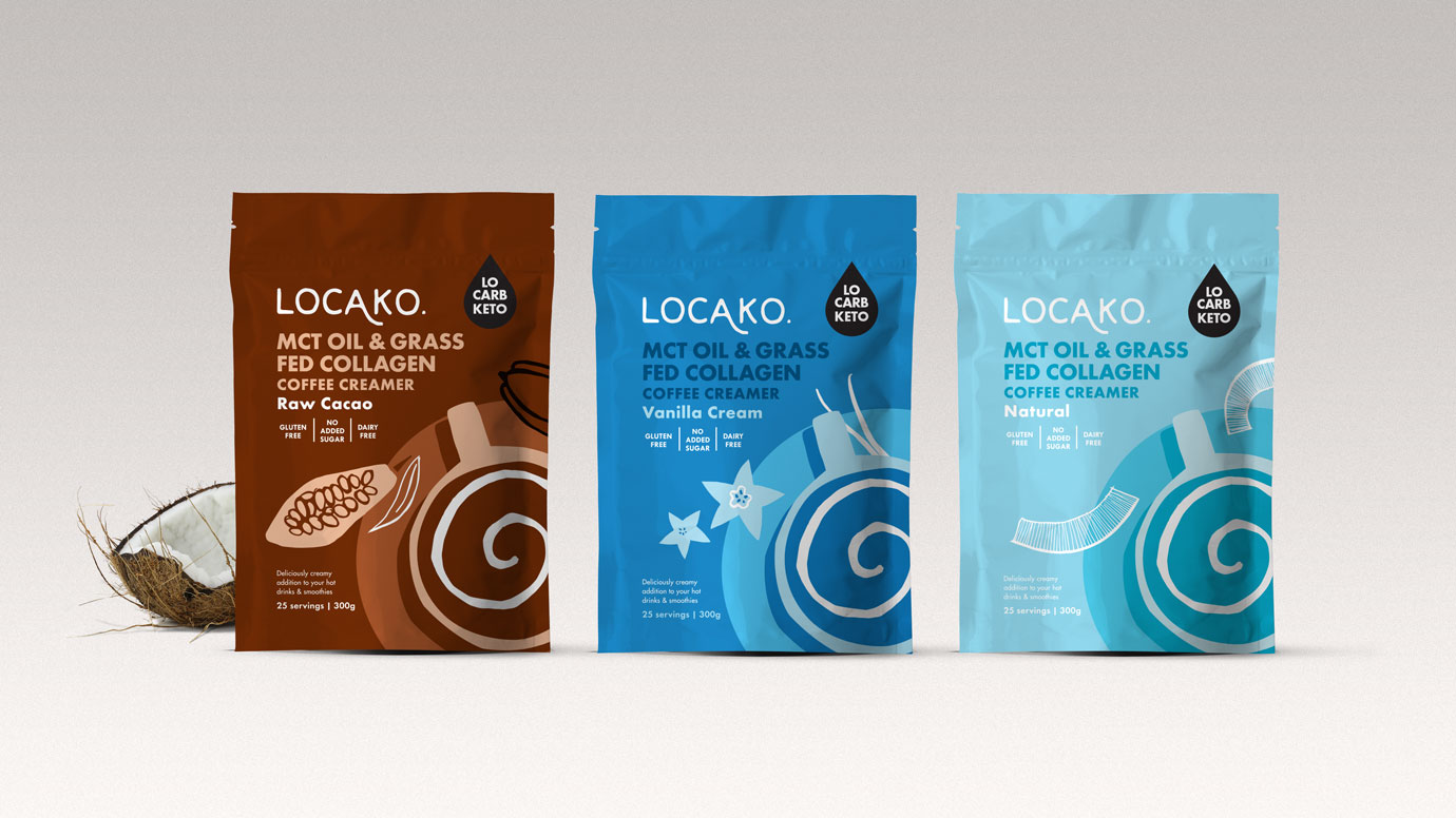
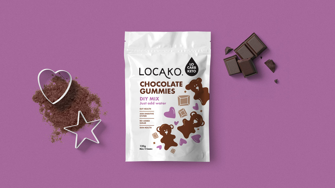
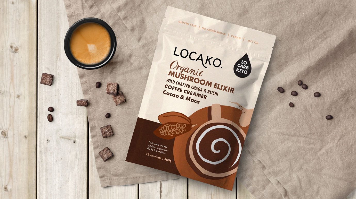
Our aim was to create packaging that meets two needs. Firstly, maintain the ’instagram-worthy’, boutique look and feel important for the online sales. Secondly, to make the products stand out in store on a busy supermarket shelf.
It was also necessary to ensure that the new look doesn’t alienate the current customer base. For that to happen the original colour palette and the logo had to remain unchanged.
One of the most important tasks in this project was sorting out the information hierarchy. Locako’s products have a wide range of benefits and it was crucial to communicate them all in the right order.
To introduce some visual flavour communication, we’ve created a set of hand drawn minimal illustration. While simple, they easily communicate taste cues and allow the range to feel unified despite the wide range of background colours. Thanks to this, it has been easy to introduce new ranges of products while keeping the brand consolidated.
Since the introduction of the new packaging, the brand is going from strength to strength and their products are flying off the shelves.
Love it?get in touch