Lotion Bar
Branding, Packaging Design
Creating a minimal brand for pure
and natural cosmetics
Reema, the entrepreneur of ‘Lotion Bar’ commissioned us to design a unique brand and packaging to help her market her expanding lotion range.
The essence of the Lotion Bar brand is being gentle to the Earth and creating products free from unnecessary and unethical ingredients.
Those all natural, organic cosmetics demanded a brand focusing on the purity of the products rather than featuring gimmicky and obvious natural cues.
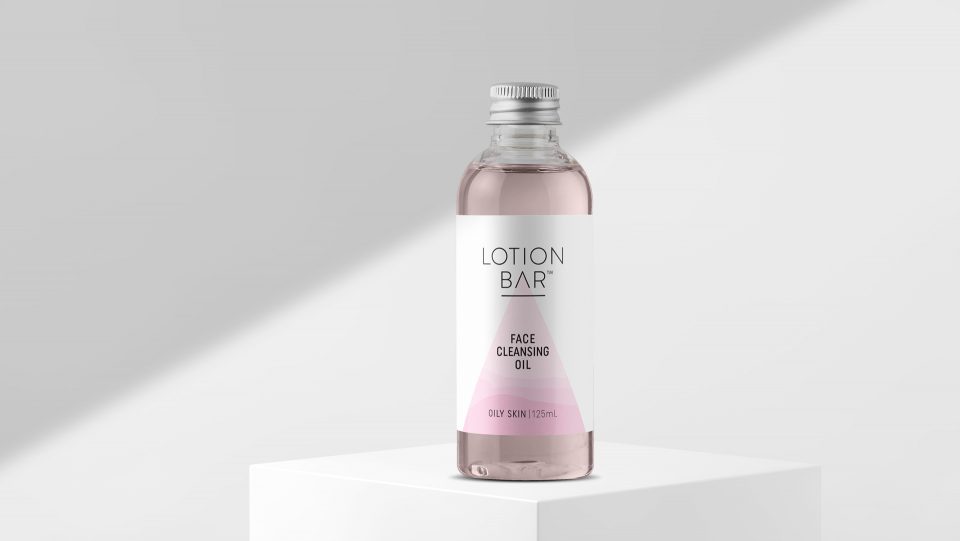
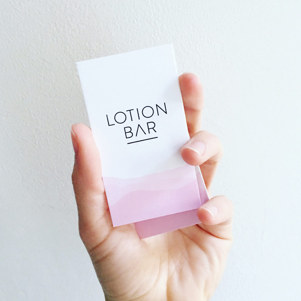
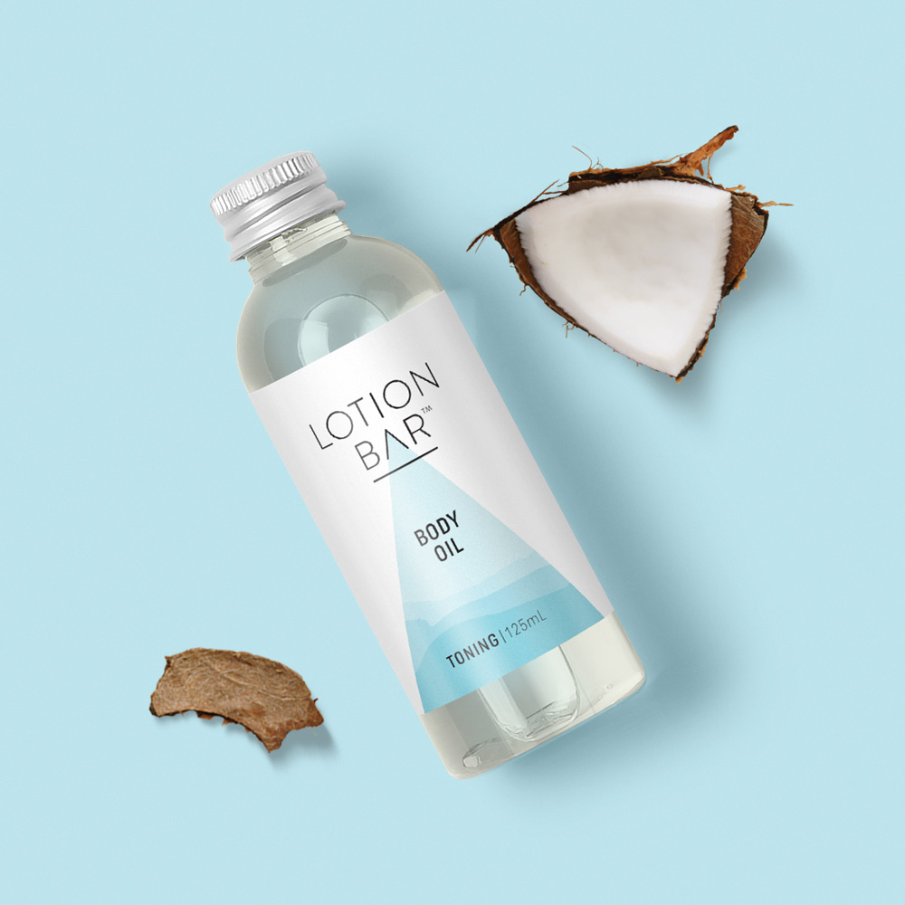
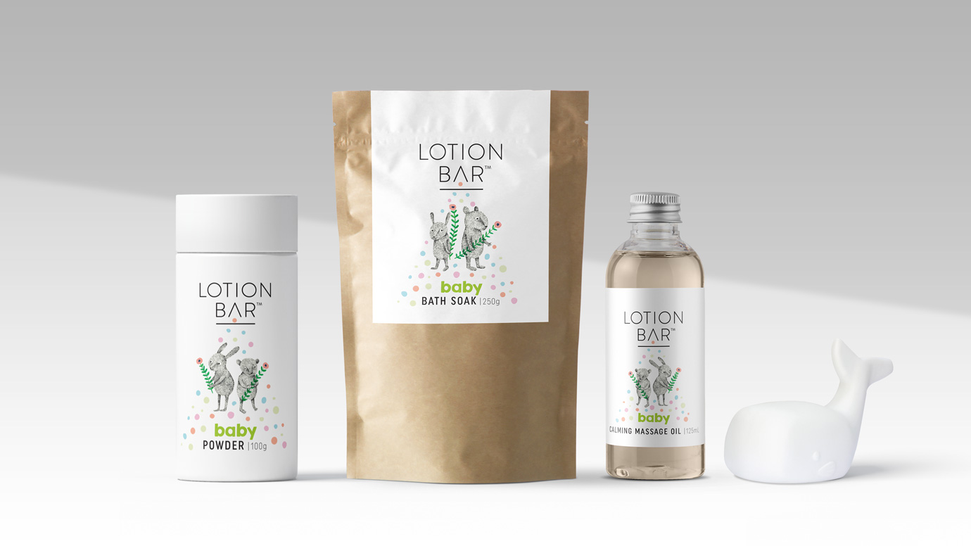
Reema’s attitude towards the Earth has inspired the logo and architecture for this brand.
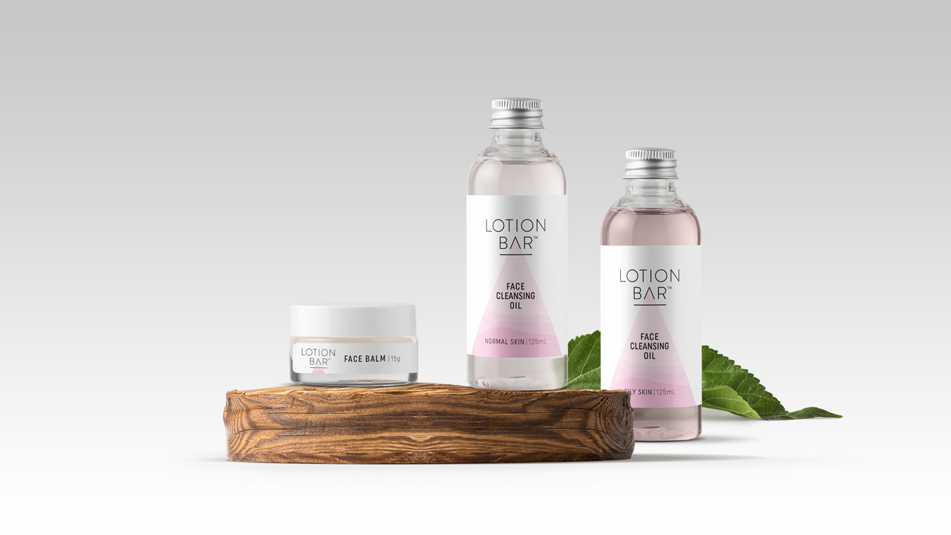
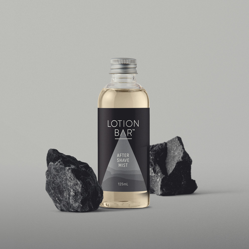
Using the sharp shape of the letter A we have created a coloured triangle symbolising a beam of light illuminating the Earth. We also found it imperative to pay homage to Reema’s North East Indian roots featuring the rolling tea hill landscape of the Assam region inside the coloured shape.
While simple, this architecture allows for easy communication of Lotion Bar’s wide spectrum of products. Each range is clearly differentiated with varied beam and background colours.
Love it?get in touch